How We Turned a Pharmacy Website into a Refill Power Tool
Patients stopped calling. Staff stopped stressing. Refills now happen with zero confusion.


Why This Project Happened
Ultracare Pharmacy had a website—but it was mostly informational. Patients couldn't check anything. Staff were fielding the same refill questions 20+ times a day. It wasn’t working for anyone. The moment of clarity? A pharmacist friend casually said: "Patients keep calling just to ask if their refill is ready." This wasn’t just a redesign—it was a rethink. A rebuild.
The goal? Turn the site into a tool that actually helps.Video Walkthrough
What was broken :
The original website was just static text. No functionality. - Patients kept calling to ask about refill status. - Staff spent hours daily giving the same updates manually.
Who was affected
Patients (uncertainty, phone calls), Staff (mental load, bottlenecks)
Why it mattered
It wasn't scalable. It wasn't useful. It added stress across the board.

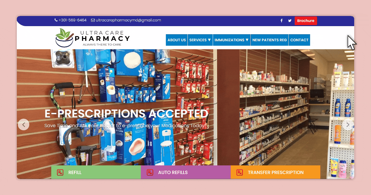
Ultracare Old Site
Research & Validation
I interviewed a pharmacist friend. I reviewed support calls. I tested what users typed into the old contact form.
Key insights:
1. Patients don’t want to log in. Just check a number. 2. People get anxious when status is vague. 3. Staff keep giving the same updates over and over.
They just want to know if it's ready or not.

Design Hypotheses

The Solution
I didn’t treat this like a website redesign. I treated it like a product build. Every screen had to reduce confusion, not just look nice. Patients were stressed. Phones were ringing. We needed self-service to feel human, fast, and trustworthy.
✅ One field. Zero friction.
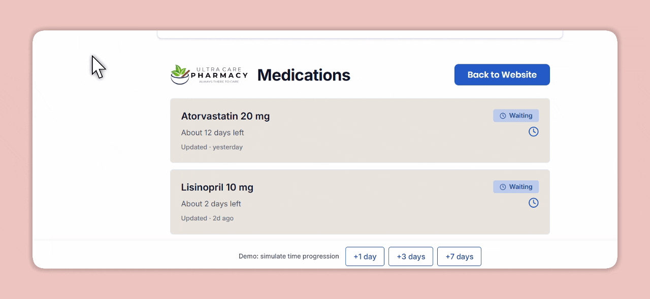
1. RX Entry on Homepage
No login. No confusion. Just type your RX number and track
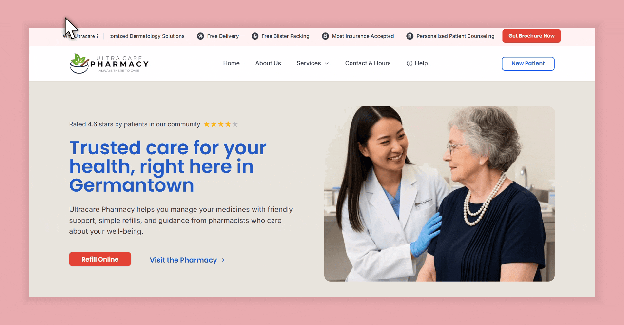
We removed all barriers to entry—just one clear input field centered on the homepage.
✅ Clear status for peace of mind.
2. Refill Tracker with Real-Time Status
Patients see exactly where their medication stands. From "Waiting for Doctor" to "Ready for Pickup", each status is specific and instructive.
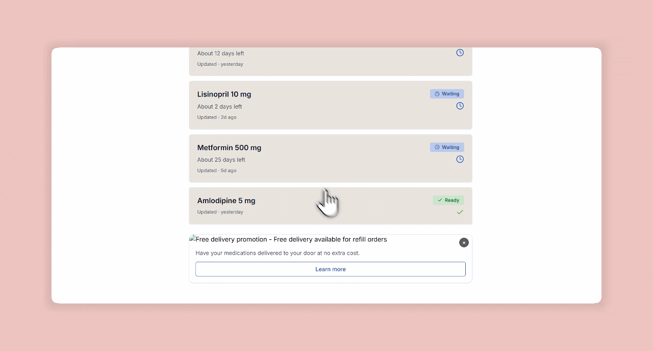
Each label was crafted to sound calm, transparent, and reassuring. No generic "In Progress".
✅ Reassuring microcopy, color-coded clarity.
3. UI That Replaces a Phone Call
Every line of text mimics what a staff member would say. Icons and soft tones reduce anxiety, while success states build trust.
"Waiting on your doctor’s approval” beats “Still processing.”
4. Before vs After: Homepage + Tracker
We transformed a passive brochure site into a responsive product tool.
 Before
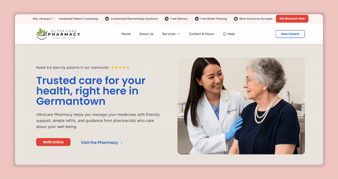 After
AfterThe whole journey—designed like a system.
5. Flow Overview: Behind the Scenes
This isn’t just a page redesign. It’s a full-service refill tracker, layered with product logic and designed for real-time answers.

This isn’t just a page redesign. It’s a full-service refill tracker, layered with product logic and designed for real-time answers
Designing in the real world means designing with constraints.
This wasn’t built in a vacuum. Every decision was shaped by the needs of real people—and real system limitations.
Cross-Functional Syncs
Regulatory Constraints
- •No user accounts allowed (HIPAA-sensitive flow)
- •Zero PII storage. Rx numbers only used for transient query
This forced precision in copy, clarity in visuals, and intuitive fallback states
Technical Constraints
- •Pharmacy backend wasn’t originally designed for real-time status
- •No sandbox API—so we staged live data on a dev branch
- •Built a fake tracker prototype first to test user language and error states
1<form onSubmit={handleSubmit} className="flex gap-2">
2  <Input
3    type="text"
4    placeholder="Enter Rx Number"
5    value={rx}
6    onChange={(e) => setRx(e.target.value)}
7    required
8  />
9  <Button type="submit" disabled={loading}>
10    {loading ? "Checking..." : "Track"}
11  </Button>
12</form>
131<section className="text-center py-20">
2 <h1 className="text-4xl font-bold">
3 Refill clarity for patients. Breathing room for staff.
4 </h1>
5 <p className="mt-4 text-lg">
6 Type your Rx number. That’s it.
7 </p>
8</section>1<div className="space-y-4">
2 <h2 className="text-xl font-semibold">Designed to feel human</h2>
3 <ul className="list-disc pl-5">
4 <li>No portals or logins</li>
5 <li>Plain-language status updates</li>
6 <li>Fast, mobile-first UI</li>
7 </ul>
8</div>
91<div className="grid md:grid-cols-2 gap-8">
2 <div>
3 <Image src="/refill-status.png" alt="Status tracker screen" />
4 </div>
5 <div>
6 <h3 className="text-lg font-medium">Know where your refill stands</h3>
7 <p>No guesswork. Just a real-time answer.</p>
8 </div>
9</div>Real-World Impact
drop in refill-related calls
Refill checks now
demo testers completed without error
“Patients are finally using the site for something useful.”
What I Learned
- ✨Clarity matters more than speed in healthcare UX
- ✨UI can replace phone support if done right
- ✨Designing for real-world workflows is product thinking